
The New Look for Texts
I've had a few questions asking why the texts appear to be in front of the graphs after the July 2026 update. In truth, the texts were in front of the graph before the update as well. What has changed is that there is now a small gap around the texts, which makes it more obvious than before that the texts are in front of the graph.
I understand that the sudden change could look a bit weird at first, and I understand why users might ask about it. Hopefully this article will help.
It's About Accessibility
Consider the two graph shown below. The graphs have all of the same settings. However, the first graph shows the text as it would have appeared before the July update, while the second graph was created after the update.
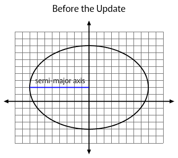
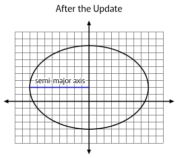
I've had some users ask for better contrast between the texts and the grid lines, and these examples show that they had a valid concern. The text on the right is easier to read, and that's because the gap around the text keeps the grid lines from running into the text.
For some of us, that difference may seem small. But what if some of our students have visual processing challenges (e.g., dyslexia)? If some students find it challenging to distinguish letter forms in ordinary text, what might it be like for them when there are lines intersecting the letters in unexpected ways? It's this concern that pushed the gap from being a possibly nice option to being the default.
But What If the Texts are Over the Graph?
Most of the time we can adjust the settings to keep this from happening. One of the easiest ways is to change the label spacing, as illustrated below. I never found that students really needed every line labelled anyway when I was teaching; labellng every fifth line was my default to reduce clutter while still being clear.
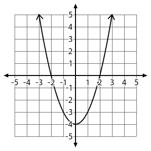
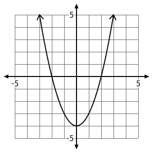
In fact, unless the label actually obscures a key feature of the graph (in which case it would probably help to drag the label a bit), it might not even be a big deal anyway. The human brain is really quite good at grouping related parts of a figure together, even if there are gaps. (Read about Gestalt psychology if you're curious.)
Do I Absolutely Have to Keep the Gap?
Reluctantly, I did add a setting to the bottom of the Customize page to turn the gap off. So if you are a Boost subscriber, you can remove it. But I recommend that you do this only as a last resort. Yes, the gap may look strange initially. But I think it will grow on you as you get used to it, and if it improves accessibility, it's a good thing.